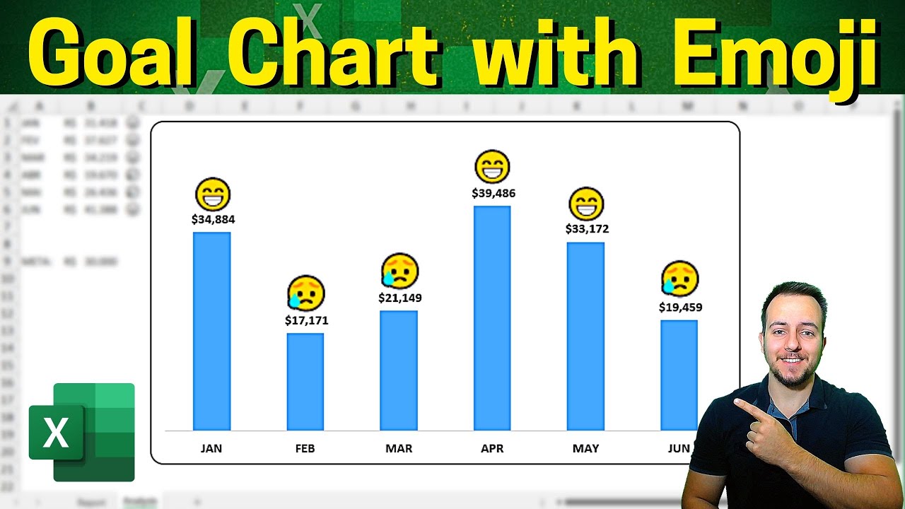
In this Excel video tutorial, we'll learn how to make a modern and beautiful column chart in Excel. This interactive and dynamic chart in Excel spreadsheet can help you a lot in your presentations, in your meetings with Excel and in your dashboards in Excel. Whenever you update any value in your table, in your database, all values in the chart will be updated automatically following the criteria you've defined.
In this free Excel tutorial, we are going to use emojis to create our interactive chart. Whenever the graph value reaches the target, the emojis face will smile. Whenever the value is below the target, the emojis face will be sad. In this way, we managed to create a dynamic and interactive chart in Excel, using the same principle as the goal chart in Excel, excel actual vs target chart, but instead of using lines to define the goal, we will use emoticons to help us in this process.
In order for us to make the chart interactive and update automatically, we will need to use the IF function here in Excel. The IF function in Excel helps us to automate repetitive tasks and processes. That way, whenever the value is above the target, we will get the positive result. And whenever the value does not reach the target, we will get a negative result. We can make these conditions and criteria using the IF function in Excel, one of the most important formulas in Excel.
#JopaExcel #Dashboard #Excel


