In this video I will show you how to construct shapes to represent different types of people in your genogram: Men, Women, Bisexual, Transgendered and Deceased people. I will also show you how to include important assessment data and colour code illnesses.
Here are some awareness ribbon ideas for your colours: [ Ссылка ]
Google Drive Folder (CC BY files being added): [ Ссылка ]
Website: www.nursekillam.com
In part 1 of this video I shared helpful shortcuts and tips for setting up a genogram inside Visio. [ Ссылка ]
Genograms in Visio Part 2: Shapes that represent people and colour coding of illnesses. [ Ссылка ]
Closed Captioning in progress:
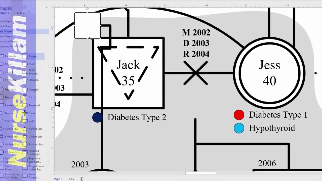
The square signifies a male.
A circle signifies a female.
A transgendered individual has the shape of the gender they were born with inside the shape of the gender they identify with.
A bisexual individual has a dotted upside-down triangle inside the shape.
A homosexual individual has a upside down triangle inside the shape.
To build the symbol for your index person copy/paste a second shape, adjust it to be slightly smaller and overlay it on the index person.
All shapes need a name and age. To add their name and age simply click on the sape you created and start typing. I recommend changing the font. Use Control + A to select all the shapes then adjust the font in the font section of the home tab.
Significant assessment data is noted below the shape. To add information above or below the shape use a the text tool from the tools section under the home tab. Ensure you use the dynamic grid to consistently space information. You can change the font now or change all the font later by using control A to select everything or by selecting the text you wish to change by holding the shift key as you select items.
In this example, chronic illnesses are indicated along with any other significant health challenges. Colour coding can also be used and is recommended as it helps with easy identification and assessment.
There are several ways to colour code illnesses inside Visio. The outside or inside of the shape can be coloured. This approach can become tricky when individuals have several comorbidities.
Alternatively, segment of the shape can be coloured. For a square you can use smaller squares. It may be hard to get the layering proper, but the shape is easy enough to create.
If you are using a shaded shape for households, the coloured square needs to be in a layer above a white square that is perfectly below any transparent shapes above it.
However, in a circle it can be tricky to create the shapes. The best way is to use a combination of lines and the freeform tool. To keep smooth outer lines always send the smaller shapes behind the outer shape for the individual. If you have shading behind the family unit you may need another large circle behind it. As you can see it can be tricky to get the shape and layering correct.
Or, you can include a colour inside a small shape beside the written information below the shape.
Perhaps the easiest way is to colour the background of the text box. However, be careful that the font remains easily readable.
Ensure you use a consistent approach. Also, be consistent in the font size and spacing of this information. When colour coding the information I like to use the associated awareness ribbons as inspiration. It is not always possible to use them. If two illness have similar colours you want to be sure that they are easily distinguishable on the genogram so you will need to choose an alternate colour for one of them.
You can add colour to a shape under the format shape menu you opened earlier on the right hand side or in the shape styles group under the home tab. Choose a solid fill if you want one colour. If you want a multi-coloured shape use the gradient and set the colours accordingly.
When information is unknown to the family include a question mark.
A person who is deceased is signified with a shape that has four small lines coming partially in from the four corners. To make this shape anchor lines to the anchor points in the form of an X. For a square the lines should be anchored to the corners of the square. For a circle anchor them in the positions that would go towards the corners if it was a square. Then place a circle over the shape and adjust the size to be smaller than the shape below. Change the colour of the lines to match the shape below or to have no line. Then make the weight of the lines that form the x the same weight as the shape. The date of death goes above the shape.
Recommended APA Resources [ Ссылка ]
Check out the links below and SUBSCRIBE for more youtube.com/user/NurseKillam


![[FULL SERMON] THE WEAPONS OF OUR WARFARE ARE NOT CARNAL (part 1) - Apostle Joshua Selman 2022](https://i.ytimg.com/vi/Aj8g6HxaK6o/mqdefault.jpg)


