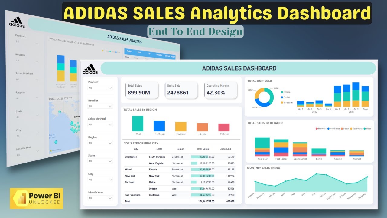
Welcome to DataMinds Academy, your ultimate destination for learning Power BI! In this exciting tutorial, we show you how to create an Adidas Sales Analysis Dashboard in Power BI 2025 from scratch using an Excel file as the data source.
This step-by-step guide will walk you through building a professional and visually appealing dashboard that provides meaningful insights into Adidas sales performance. You will learn:
Link for Dataset & Theme: [ Ссылка ]
How to connect Power BI to an Excel file containing Adidas sales data.
Data cleaning and transformation techniques in Power BI Query Editor to prepare your dataset.
Designing and creating visuals like bar charts, line charts, and KPIs to display key metrics such as total sales, category-wise performance, and trends over time.
How to use slicers and filters to make the dashboard dynamic and interactive for end users.
Tips for formatting, theming, and customizing the dashboard to make it visually stunning and easy to interpret.
Whether you're a beginner or an advanced Power BI user, this tutorial will help you improve your data visualization skills while working on a practical, real-world project. By the end of this video, you'll have a complete Adidas Sales Analysis Dashboard ready to impress stakeholders or clients.
Don’t forget to like, comment, and subscribe to DataMinds Academy for more Power BI tutorials and dashboards.
🔖 Tags (SEO Boost):
#AdidasSalesAnalysisDashboardInPowerBI #AdidasDashboardInPowerBI2025 #SalesAnalysisInPowerBI #PowerBIDashboard2025 #DataMindsAcademy #PowerBITutorial #ExcelToPowerBI #PowerBIForSalesAnalysis #CreateDashboardInPowerBI #PowerBIDashboardTutorial


