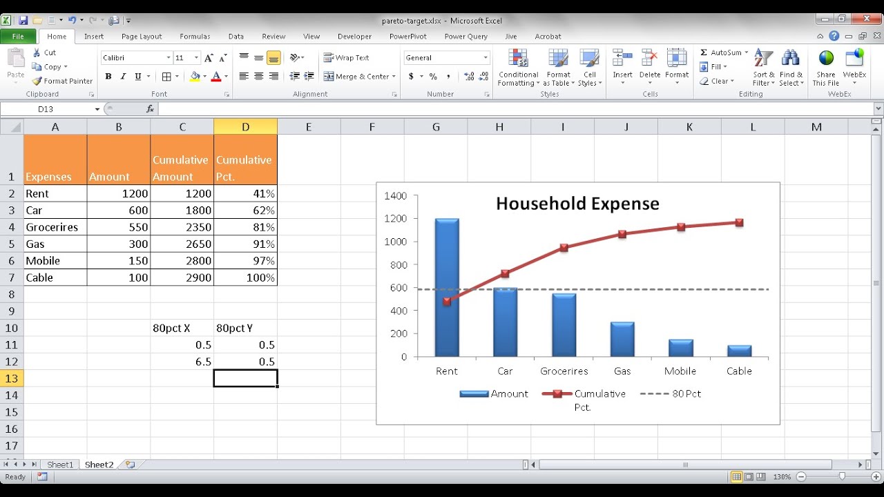
This video shows you how to create a Pareto chart with a target line to show the 80 percent mark. This is an enhancement to the 80-20 rule of this chart visualization by helping you with the analysis of what the data should drive to. The target marker line is quite easy to add! This line is visually better since it covers the whole plot area and doesn't look like it another part of the "data" in the chart.
🔔 SUBSCRIBE to my channel ➜ [ Ссылка ]
🏫 Excel Training ➜ [ Ссылка ]...
📚 Excel Books & Tech Gear ➜ [ Ссылка ]
⚙️ Tools: Screencasting ➜ [ Ссылка ]
⚙️ Tools: Microsoft Office ➜ [ Ссылка ]
⚙️ Tools: TubeBuddy ➜ [ Ссылка ]
📝 This description may contain affiliate links and we'll receive a small commission if a purchased is made using the links (but at no additional cost to you). It'll support the channel and so more videos like this can be made. Thanks for your support!
🎁 If you find these videos useful and want to support my channel go to [ Ссылка ]
#excel
#msexcel
#doughexcel
-~-~~-~~~-~~-~-
Please watch: "Convert Table in a PDF File to Excel"
[ Ссылка ]
-~-~~-~~~-~~-~-
Create a Pareto Chart with a Target Line
Теги
msofficetrain101microsoftexcel 2010doughexcel80:20 principlecreate pareto charttutorialtraininglearn excelPareto Analysis In ExceltipPareto Chartpareto analysisparetoexcel youtube channelpareto principlepareto chartPareto AnalysisdougMicrosoft Excel (Software)Create Pareto AnalysisExcel helppower query


![Foley Bladder Catheterization MALE [ASE]](https://i.ytimg.com/vi/iWNYqV2N6tE/mqdefault.jpg)


