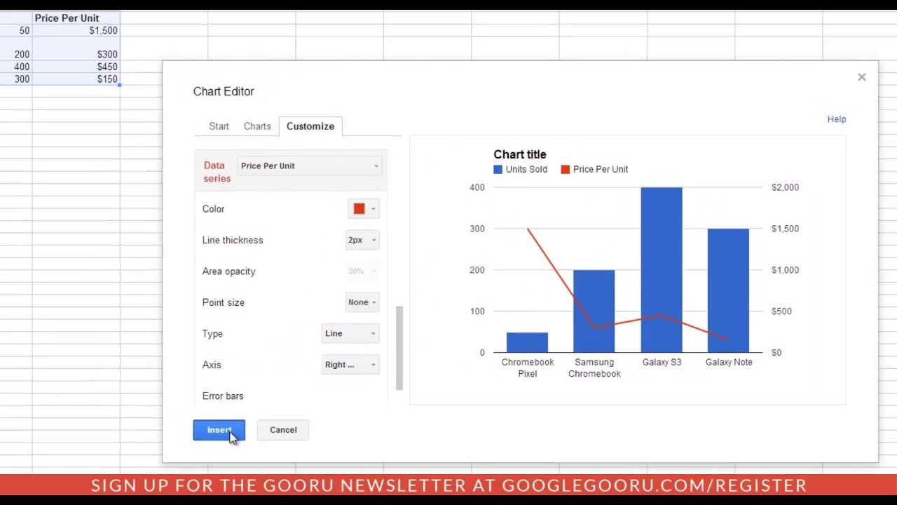
A recent update to Google Spreadsheets has added a new feature for former Excel users who are looking to get additional functionality. If you have two sets of data, and you'd like to use a chart, a second Y-Axis can represent your data on two different scales at the same time.
Check out this quick video to learn how you can add a second Y-Axis to effectively present your data with Google Spreadsheets.
To watch the updated video and read the full article on the BetterCloud Monitor, visit:
[ Ссылка ]


![Что происходит, когда бросаешь курить? [AsapSCIENCE]](https://i.ytimg.com/vi/tM-G_VVIj9M/mqdefault.jpg)

![Звуковые иллюзии, которые работают на всех (почти) [Veritasium]](https://i.ytimg.com/vi/8pCuUfbdheE/mqdefault.jpg)


