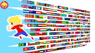
In this video, we visualize the stats of 188 countries in terms of their Income, Health and Education levels. The method of comparing is through their Human Development Index (HDI), developed by Indian Nobel prize winner Amartya Sen and Pakistani economist Mahbub ul Haq. While there may be other factors (such as happiness, freedom, work hours etc) that determine the "best" countries, we shall just assume the level of development (ie HDI ranking) as the sole determinant.
Note:
The yellow '$' Sign refers to Gross National Income per Capita (Adjusted for Purchasing Power Parity) in USD, in short GNI per capita (PPP$).
The green graduation hat represents the average of mean and expected years of schooling.
The red '+' symbol represents both males and females life expectancy in years.
The bar is a linear visualization of the rankings of each of the 3 category, a ranking to compare the relative individual stats of countries.
Due to lack of information, the following countries: Monaco, Nauru, North Korea, San Marino, Somalia, Tuvalu and Vatican City are excluded.
Non UN member states (eg Taiwan & Kosovo) are also excluded.
Territories by countries (eg Hong Kong, Macao & Puerto Rico) are also excluded for consistency, although HK would be tied with Sweden at 7th if included.
Source:
United Nations Human Development Report 2018 [ Ссылка ]
Flags Images are from Wikimedia Commons.
Music Used:
Bush Week by Nihilore [ Ссылка ]
Creative Commons — Attribution 3.0 Unported — CC BY 3.0
[ Ссылка ]...
Music promoted by Audio Library [ Ссылка ]


![🤯 МОЙ ПЕРВЫЙ ПРОЕКТ НА VUE JS ЗА 12 ЧАСОВ! [ Nuxt / TypeScript / Appwrite / Shadcn Vue ]](https://s2.save4k.su/pic/oPyGd05ChVs/mqdefault.jpg)


