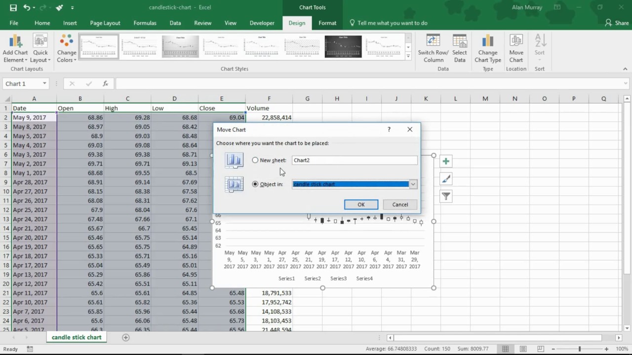
Create a Candlestick Stock Chart (Open-High-Low-Close) in Excel to show 30 days of price movements.
This video shows you how to create a web query to automatically import stock data from Google Finance on the Web into your spreadsheet.
It the shows you how to create a Candlestick chart to present the data graphically.
Excel provides a simple way to create these types of charts, but there are typically a few formatting options to be applied afterwards.
The following Candlestick chart description comes from Wikipedia.
"A candlestick chart (also called Japanese candlestick chart) is a style of financial chart used to describe price movements of a security, derivative, or currency. Each "candlestick" typically shows one day; so for example a one-month chart may show the 20 trading days as 20 "candlesticks"".
"Candlesticks are usually composed of the body (black or white), and an upper and a lower shadow (wick): the area between the open and the close is called the real body, price excursions above and below the real body are called shadows. The wick illustrates the highest and lowest traded prices of a security during the time interval represented. The body illustrates the opening and closing trades. If the security closed higher than it opened, the body is white or unfilled, with the opening price at the bottom of the body and the closing price at the top. If the security closed lower than it opened, the body is black, with the opening price at the top and the closing price at the bottom. A candlestick need not have either a body or a wick."
Find more great free tutorials at;
[ Ссылка ]
*** Online Excel Courses ***
The Ultimate Excel Course – Learn Everything ► [ Ссылка ]
Excel VBA for Beginners ► [ Ссылка ]
Advanced Excel Tricks ► [ Ссылка ]
Excel Formulas Made Easy ► [ Ссылка ]
Creating Sports League Tables and Tournaments in Excel ► [ Ссылка ]
Connect with us!
LinkedIn ► [ Ссылка ]
Instagram ► [ Ссылка ]
Twitter ► [ Ссылка ]
Create a Candlestick Stock Chart (Open-High-Low-Close) in Excel
Теги
Microsoft ExcelCandlestick ChartStock ChartOpen-High-Low-CloseExcel ChartsExcel DashboardsComputergagaAlan MurrayCandlestick Stock Chartcreate a stock charthow to create stock charts in excelexcel stock open-highhow to create stock chart in excelexcel stock chart volume open high low closeexcel charts and graphs tutorialexcel stock chartstock chart in excelexcel stock chart open high low closeexcel for stock tradingexcel for stock analysis


