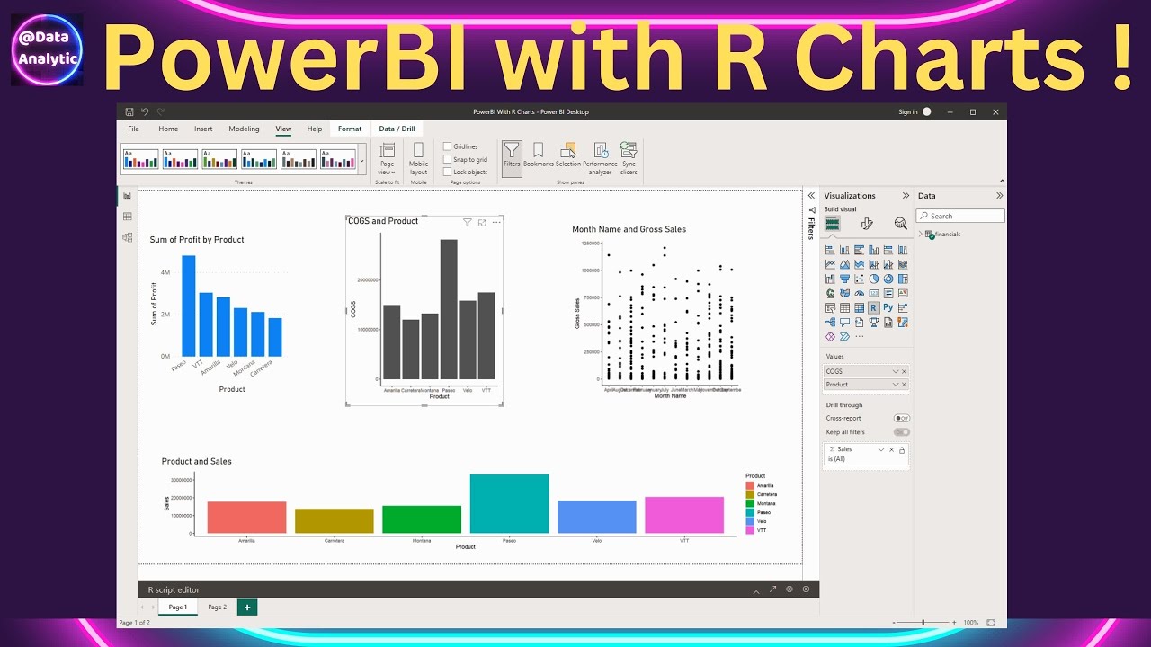
Learn how to create GGPLOT charts in PowerBI. Also see how to use RStudio to create the R code and bring it back to PowerBI environment. GGPLOT charts will behave interactively in a drill down mode. #powerbi_training #dashboard #datavisualization
Chapters
0:21 Get Sample data in PowerBI
0:43 View the loaded data in PowerBI
0:51 Create a PowerBI BarChart
1:11 Create a R Script to create a GGPLOT Bar Chart
3:17 Add a fill colour in our GGPLOt Bar Chart
3:35 GGPLOT Bar chart is behaving interactivly
4:02 Use RStudio to create the Chart and bring it back to PowerBI
5:52 Please Subscribe
We specialise in practical, concise and sharp videos on various data related topics like statistics, visualisation, automation, validation.
We mainly create videos on R, Python and other related technologies which compliment the data science needs.
If you are beginner then watch this video to get started
How to install R and R Studio [ Ссылка ]
Watch our playlists
GGPLOT charting galore [ Ссылка ]
DPLYR series - DPLYR is one of the most important tool in data handling. Learn all about it in [ Ссылка ]
Geo analytics mapping techniques [ Ссылка ]
Statistics in R [ Ссылка ]
Python - statistics, automation and visualisation [ Ссылка ]
HighCharter interactive and static charting [ Ссылка ]
Some amazing stuff that Excel can do [ Ссылка ]
Our everygrowing playlist of sharp and short videos in the #shorts format for one minute learning [ Ссылка ]


