📗 Free Workbook Download: »» [ Ссылка ]
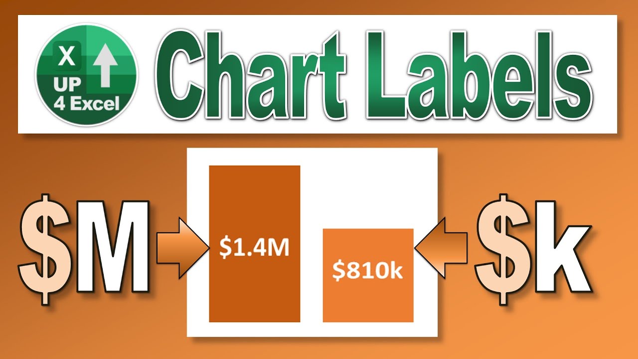
🎯 Get rid of all those digits cluttering your chart….format labels in thousands or millions and keep your Excel Charts clean and clear. I'll show you how.
In this comprehensive Microsoft Excel tutorial, I'll guide you through the detailed process of refining your chart data labels to enhance both their readability and overall presentation. By the end of this video, you’ll be equipped with practical techniques to customize and format your charts effectively.
Here's a breakdown of the topics I'll cover and how they can benefit you:
1. Adding Data Labels to Charts: I’ll start by showing you how to add data labels to your Excel charts. Specifically, I’ll demonstrate how to position these labels inside the end of your data series. This step is fundamental for making your charts more informative, as it ensures that each data point is clearly labeled, allowing viewers to quickly grasp the values represented in the chart.
2. Formatting Data Labels with Custom Number Formats: Next, I'll guide you through the process of adjusting the number format of your data labels. Instead of sticking with the default general format, you’ll learn how to apply a custom number format that represents large numbers in a more digestible way. For example, I’ll explain how to format numbers to display in millions or thousands, which simplifies the presentation of large figures. This will help in reducing visual clutter and making your data easier to read and interpret.
3. Applying Custom Number Formats: In this section, I’ll dive deeper into creating and using custom number formats. I’ll show you how to use commas in your format code to omit unnecessary digits. Specifically, you’ll see how to format numbers with two commas to display values in millions with one decimal place, such as "1.2M". Conversely, for thousands, a single comma in the format code will show values in thousands, helping you to streamline your data presentation.
4. Enhancing Chart Aesthetics: Once your data labels are formatted, I’ll cover how to further enhance their appearance. This includes making text bold, adjusting font sizes, and changing the font color to white or any other color that suits your chart’s design. I’ll explain the steps to apply these formatting changes using the main menu options in Excel. This ensures that your data labels not only convey information clearly but also contribute to a polished and professional look for your charts.
5. Manual Formatting Adjustments: Finally, I’ll address a common issue with using the format paint tool for data labels. While format paint can replicate font colors, it often fails to copy custom number formats correctly. I’ll explain why manual formatting adjustments are necessary and provide you with a step-by-step approach to applying the desired number formats manually. This practical advice will help you avoid formatting inconsistencies and ensure that your data labels meet your specific requirements.
By following this tutorial, you'll gain actionable skills to refine your Excel charts, making them more effective for data analysis, presentations, and reporting. The techniques demonstrated will enable you to present large data sets in a clear, concise, and visually appealing manner. Don’t miss out on these valuable tips for enhancing your Excel chart presentations.
By mastering these techniques, you’ll significantly improve the clarity and effectiveness of your Excel charts. Customizing data labels and applying precise number formats will not only enhance the readability of your charts but also elevate the overall professionalism of your reports and presentations.
This tutorial is designed to provide you with actionable insights and practical skills that you can implement immediately. Whether you're preparing financial reports, creating presentations, or analyzing complex data sets, these formatting strategies will help you communicate your data more clearly and effectively.
Remember, the key to impactful data visualization lies in presenting your information in a way that is both accurate and accessible. By applying the custom number formats and aesthetic enhancements covered in this video, you'll be able to highlight critical data points, reduce visual clutter, and ensure that your audience quickly grasps the insights you’re sharing.
If you found this tutorial helpful, consider subscribing to stay updated on more Excel tips and tricks. For any questions or further assistance, feel free to leave a comment below. I’m here to help you with any Excel-related queries you might have. Thank you for watching, and I look forward to seeing you in the next video!


