#xerrorbarinorigin #yerrorbarinorigin #sayphysics
0:00 - How to Plot Y Error and X Error Bar Graphs in Origin
0:13 - How to Understand Data Structure Before Plotting in Origin
0:41 - How to Set Y Error Bars in Origin for Clear Visualization
1:49 - How to Identify and Plot X Error Bars in Origin
3:04 - How to Combine X and Y Error Bars in Origin for Comprehensive Plots
4:21 - How to Customize X and Y Error Bar Plots in Origin
5:00 - How to Style Error Bars for Professional Graphs in Origin
5:28 - How to Change Data Point Appearance and Error Bar Colors in Origin
6:00 - How to Finalize and Optimize Error Bar Graphs in Origin
Exercise File (Origin File):
[ Ссылка ]
"Data plotting in OriginLab" "OriginLab tutorial" "Plotting with error bars" "X and Y error bars in OriginLab" "Data analysis in OriginLab" "Graphing software" "Scientific data visualization" "Data visualization techniques" "Statistical plotting" "Plotting software" "Data representation" "Data interpretation" "Data visualization tools" "Graphing tips and tricks" "Data visualization best practices" "Data presentation" "Scientific visualization software" "Graphing with OriginLab" "Plotting graphs in OriginLab" "OriginLab data visualization"
How to plot data with X and Y error bars in Origin, x error bars, y error bars, x and y error bars, xy errors, adding error bars to a graph
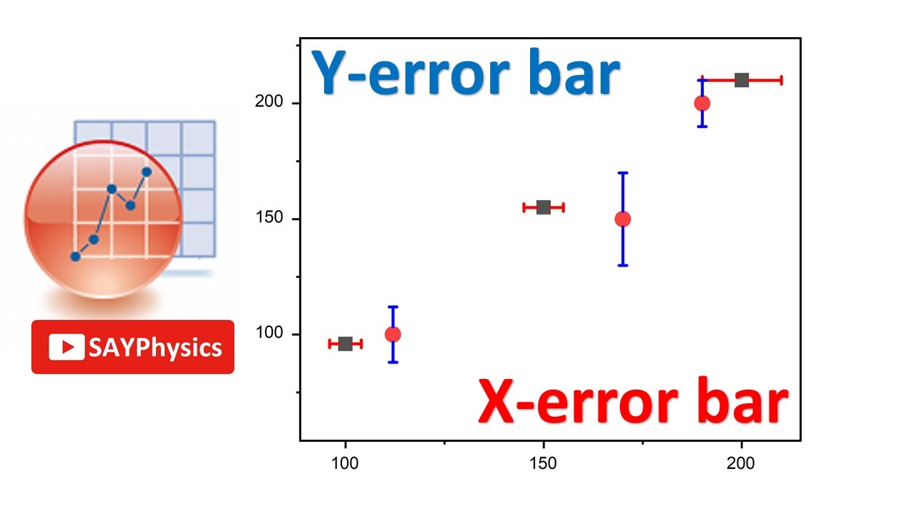
How to plot data with X and Y error bars in Origin
This video teaches how error bars can be added to a graph to indicate error or uncertainty in a reported measurement. Error bars also could be added in the 3D graph from existing datasets by the plot details dialog.
graphing: origin 8: add error bars to graphs
how to show error bar in origin
graphing: origin 9: plot error bars in 2d graph
origin tutorial add error bars to multi-line diagram
origin graph xy error
origin tutorial: add error bars to double column bar diagram
add error bar to a chart using originlab


